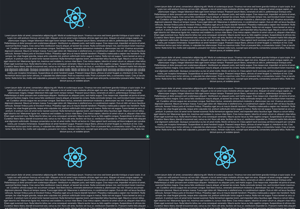
In this tutorial you will learn how to create a scroll to top button in React that you can use on your blog or in your web application. This feature is great on websites where you have a lot of content and the menu/header is not accessible to the user all the time.
Prerequisites
- NPM 5.2+ or higher
- Basic knowledge of React
Demo

1. Set up project
Start by creating a new react project using the following command
npx create-react-app scroll-to-top
Then you want to install the different packages that you will be using
- classnames: Dynamically toggle the class name of a component
- react-icons: Import and use popular icons in your react applications
npm install classnames react-icons
Lastly just add some content to App.js so you have something to scoll.
2. Create a ScrollToTop component
Create a new folder inside the src directory called components, this is where you will place your scroll to top component. Then create a new folder inside the components folder called ScrollToTop (or anything you want). Inside this folder you then want to create two additional files, index.js which will hold your main component and main.css which will contain the basic styling. Then just import the component in your App.js file.
3. Write scroll to top implementation
Start by creating an "empty" class based component and then import your css file.
import React, { Component } from "react";

import "./main.css";

class ScrollToTop extends Component {
  render() {
    return <div>Hello World!</div>;
  }
}

export default ScrollToTop;
Then import the packages that you installed earlier, for the icon you just want to import the one that you will be using.
import React, { Component } from "react";
import { FaArrowAltCircleUp } from "react-icons/fa";
import cn from "classnames";

import "./main.css";

class ScrollToTop extends Component {
  render() {
    return <div>Hello World!</div>;
  }
}

export default ScrollToTop;
Next you want to add the function that will scroll the user to the top.
import React, { Component } from "react";
import { FaArrowAltCircleUp } from "react-icons/fa";
import cn from "classnames";

import "./main.css";

class ScrollToTop extends Component {
  scrollToTop = () => {
    window.scrollTo({ top: 0, behavior: "smooth" });
  };

  render() {
    return <div>Hello World!</div>;
  }
}

export default ScrollToTop;
Now it's time to add the event listeners and the function that will show/hide the toggle button once the user has scrolled. You also want to add a visible state to the component that will default to false.
import React, { Component } from "react";
import { FaArrowAltCircleUp } from "react-icons/fa";
import cn from "classnames";

import "./main.css";

class ScrollToTop extends Component {
  state = {
    visible: false,
  };

  scrollToTop = () => {
    window.scrollTo({ top: 0, behavior: "smooth" });
  };

  toggleVisibility = () => {
    if (window.pageYOffset > 50) {
      this.setState({
        visible: true,
      });
    } else {
      this.setState({
        visible: false,
      });
    }
  };

  componentDidMount() {
    document.addEventListener("scroll", this.toggleVisibility);
  }

  componentWillUnmount() {
    document.removeEventListener("scroll", this.toggleVisibility);
  }

  render() {
    return <div>Hello World!</div>;
  }
}

export default ScrollToTop;
The toggleVisibility function will show/hide the scroll to top button, the button will be shown when the user has scrolled beyond 50px. The event listeners are added/removed in componentDidMount and componentWillUnmount in order to avoid adding the same listeners multiple times. The visible property that you have in state will toggle the class name of the component in order to later decide the styling that should be applied.
Finaly just add the icon that you imported to the render method and use the classnames package to toggle the class name depending on the visible state. You also want to add the onClick property to the icon which will use the scrollToTop function that you created earlier.
import React, { Component } from "react";
import { FaArrowAltCircleUp } from "react-icons/fa";
import cn from "classnames";

import "./main.css";

class ScrollToTop extends Component {
  state = {
    visible: false,
  };

  scrollToTop = () => {
    window.scrollTo({ top: 0, behavior: "smooth" });
  };

  toggleVisibility = () => {
    if (window.pageYOffset > 50) {
      this.setState({
        visible: true,
      });
    } else {
      this.setState({
        visible: false,
      });
    }
  };

  componentDidMount() {
    document.addEventListener("scroll", this.toggleVisibility);
  }

  componentWillUnmount() {
    document.removeEventListener("scroll", this.toggleVisibility);
  }

  render() {
    return (
      <FaArrowAltCircleUp
        className={cn("ScrollToTop", { visible: this.state.visible })}
        onClick={this.scrollToTop}
      />
    );
  }
}

export default ScrollToTop;
4. Add styling
The last step is to add the basic styling for the component. Add the following to your main.css file.
.ScrollToTop {
  position: fixed;
  right: 10px;
  bottom: 10px;
  font-size: 2.6em;
  color: #00aa6d;
  cursor: pointer;
  background: #ffffff;
  border-radius: 50%;
  transition: transform 0.2s ease-in-out;
  transform: scale(0);
}

.ScrollToTop.visible {
  transform: scale(1);
}
The component will have a fixed position and be positioned in the bottom right corner of the screen. The cursor has also been set to pointer in order to give the user some feedback showing that the button can be clicked. The border-radius is set to 50% to make the component rounded and the background color and color of the arrow together with the size of the icon has been changed. Lastly the transform property is set to scale(0) by default, this value is then changed once the visible class is appended. This will show/hide the button once the user starts scrolling. The reason for not using display is to allow the button to be animated using the transition property.
Conclusion
Now you have a scroll to top button that you can reuse throughout you website or application! The component can also be modified if you would like to have another transition or position etc. I really hope you found this guide helpful, there is room for improvements such as throttling the scroll event listener but this is a good base component that you could continue to work on. Maybe it would be a good idea to turn the component into a higher-order component (HOC) which could take two arguments offset and transition that would control the transition time and scroll offset, this would make the component more dynamic and easier to reuse.